Choosing MTG proxy card versions feels like a cosmetic problem right up until someone asks “wait, which one is that?” for the third time, or your “cool” borderless treatment turns the rules text into a gray smudge under store lighting. Version selection is secretly a gameplay decision. People just pretend it isn’t because admitting you care about frames is emotionally vulnerable.
This guide is a practical way to choose MTG proxy card versions without spiraling into 47 tabs, a Scryfall rabbit hole, and a sudden urge to build a spreadsheet for “visual cohesion.”
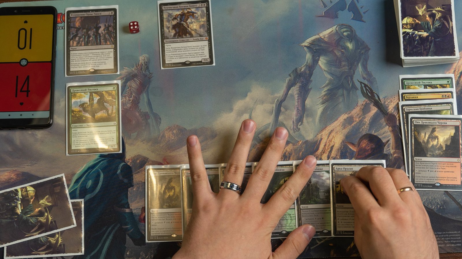
What “version” actually means for a proxy
When players say “version,” they usually mean four things:
- Set printing (what release it’s from, which affects set symbol, collector info, and sometimes templating)
- Art (original art, alternate art, promo art, etc.)
- Frame / treatment (normal frame, old border, borderless, extended art, showcase, special frames)
- Readability choices (contrast, text box style, font clarity, and whether the important info is still… visible)
If you pick these intentionally, your proxies feel like a deck. If you pick them randomly, your deck feels like a lost-and-found bin.
Step 1: Decide what you’re optimizing for (pick one, you can’t have all of them)
Before you choose versions, choose the goal. Not “all goals.” One primary goal.
Most people fall into one of these:
- Fast recognition: You want opponents and future-you to identify cards instantly.
- Maximum readability: You want clean text, clear icons, and no “stylish” frame that eats contrast.
- Aesthetic consistency: You want a cohesive look (all old border, all borderless, all one plane vibe, etc.).
- Iconic nostalgia: You want the printings you remember, even if they look like they were designed on a fax machine.
- Practical sourcing: You want versions you can reliably get good images for, so your print doesn’t look like it was downloaded through a sock.
If you don’t pick a goal, you’ll accidentally optimize for “mild disappointment.”
Step 2: Pick a default rule, so you stop making 100 micro-decisions
The easiest way to keep your sanity is to pick a default, then only override it when you have a reason.
Here are three defaults that actually work:
- Default A (most readable): use standard modern frames, avoid dark text boxes, avoid extreme showcase frames, avoid textless.
- Default B (most recognizable): use the most common “iconic” printing your playgroup expects. (Yes, this varies by group. I’m sorry.)
- Default C (aesthetic deck): pick one frame style for the whole deck (old border, borderless, showcase) and stick to it unless a card becomes unreadable.
If your deck is for cube or repeated play, consistency matters even more. You’re not just choosing art, you’re choosing your future draft experience.
If you want the print side to go smoothly, it also helps to follow file-prep basics so the version you chose doesn’t get ruined on paper. The companion guide here is worth using as your baseline: Best File Settings for Print-Ready MTG Proxies.
Step 3: Set selection, when it matters and when it doesn’t
For most casual proxy use, the “set” is less important than the art and frame. But set still matters when:
- You care about the set symbol / collector info (especially for versions with multiple variants)
- A card has multiple visually different print treatments (borderless vs extended art vs showcase)
- You want a specific “famous” printing (the one everyone recognizes)
- Your deck theme is set-based (a cube tied to a plane, a nostalgia Commander deck, etc.)
A practical approach is to treat “set” as a filter, not the starting point. Start with the card and your goal, then choose the set that gives you the right visual.
A quick table for choosing MTG proxy card versions by goal
| Your goal | Best default version choice | What to avoid (usually) |
|---|---|---|
| Fast recognition | Standard frame, common printing | Ultra-stylized showcase frames, textless |
| Maximum readability | Standard frame, high-contrast text box | Dark frames with low contrast, super busy borderless art |
| Aesthetic consistency | One frame style across deck | Mixing 5 frame styles “because it’s neat” |
| Nostalgia | Old border or early iconic art | Printings where rules text becomes tiny or muddy |
| Practical sourcing | Versions with reliable high-res images | Low-res promo scans, aggressive cropping |
None of these are “right.” They’re just less painful.
Step 4: Art selection, where people lose the plot
Art is the easiest thing to obsess over and the easiest thing to mess up, mostly because the best-looking art is sometimes the worst for readability.
Here’s the practical rule: If the art makes the text harder to read, it’s not “premium,” it’s a usability bug.
A few art-related guidelines that keep your proxies playable:
- Favor art that preserves contrast behind the name line and text box.
- Avoid extremely dark or extremely bright backgrounds where the text box blends in.
- Don’t choose art you can only find in low resolution. If your source file is soft, your printed card will be soft. Print does not do miracles.
- Be careful with full-art designs if you’re also using a frame that reduces clear boundaries. It can look amazing and play terribly.
If you want proxies that shuffle and handle well, your visual choices should also match your physical choices (finish, glare, etc.). If you’re regularly playing under bright overhead lights, you’ll notice finish problems fast. The material side is covered here: Best Cardstock for MTG Proxy Cards: Black Core, Thickness, Finish, and Why Your Deck Feels Off.
Step 5: Frame selection, the part everyone pretends is “not a big deal”
Frames do two things: they set the vibe, and they control readability. Sometimes those goals are aligned. Sometimes they aren’t.
Here’s a practical breakdown:
Standard modern frame
This is the “works everywhere” choice.
- Pros: readable, familiar, balanced contrast
- Cons: not as flashy if you’re building a themed deck
Old border
Old border proxies look great in a cohesive deck, especially for nostalgia builds.
- Pros: strong identity, cohesive theme
- Cons: some layouts feel tighter, and mixing old border with modern cards can feel visually jarring
Borderless
Borderless is the most common “I want it to look premium” choice.
- Pros: looks clean, art-forward
- Cons: small alignment errors and crop mistakes are more noticeable than people expect
Extended art
Extended art usually keeps the normal text box, which helps playability.
- Pros: still readable, still structured
- Cons: crop and bleed still matter a lot
Showcase / special frames
Showcase frames range from “nice alternative” to “why is this font angry.”
- Pros: distinct look, great for theme decks
- Cons: some treatments reduce contrast or add visual noise, and imports often botch them
If you’re choosing MTG proxy card versions for actual play, the frame question is basically: do you want your deck to be prettier, or easier to parse at speed? You can have both, but you have to pick frames that don’t sabotage the text.
Step 6: Version matching using set codes and collector numbers (without getting weird about it)
If you need a very specific printing, the cleanest mental model is:
Set code + collector number + frame/treatment
That’s how databases track variants, and it’s how you avoid “oops, wrong version” when there are fifteen printings and half of them are borderless.
If you’re using Scryfall search, the practical workflow is:
- Find the card
- Click “prints”
- Confirm the exact version (set, collector number, treatment)
- Use that as your reference when you build your proxy list
This is especially useful for versions with subtle differences (some treatments look nearly identical until you print them).
Step 7: A small, boring checklist that prevents 90% of regrets
Before you finalize your versions:
- Can you read the name line at arm’s length?
- Can you read the rules text under harsh lighting?
- Is the mana cost clear, especially for hybrid and phyrexian symbols?
- Are you mixing frame styles on purpose, or by accident?
- Are your basics consistent (frame and art), or are they a chaotic pile?
- If you’re building for repeated play (Commander staples pool, cube), will this still feel coherent six months from now?
If the answer is “i don’t know,” pick a default and move on. Future-you will survive without the perfect showcase variant.
Final thought: choose versions like you choose sleeves
If you want your deck to feel intentional, MTG proxy card versions need a standard. Not a perfect standard. Just a standard.
Pick what you’re optimizing for, lock in a default, and override it only when there’s an actual reason. That’s how you get a deck that looks good, plays clean, and doesn’t turn every draw step into a tiny art critique.